Brand guidelines
Brand guidelines
Below are the some of our main principles to follow. These are not written in the stone, but if you want to diverge, catch up with our marketing first.
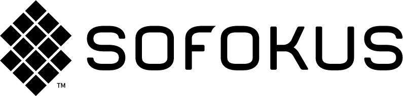
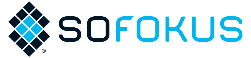
Logo
Sofokus has two main logo types: colorized and mono. From both of these, we do have variations based on your need. Please choose the suitable version depending on the background darkness, usage (print/CMYK vs web/RGB) and scalability-need (vector vs bitmap).
Logo has safe zones around the logo that matches the size of “O” from the logo. There shouldn’t be any other logos, objects or borders inside the safe zones.
Colours
We have three primary colors and few special colors for text and background use.


Fonts
Sofokus uses only one font family:
Source Sans Pro
- Black and all caps for heading and subheading
- Extra light and all caps for additional heading
- Light for body text
- Semibold to highlight something from body text
This font family needs to be installed on your computer if your presentations, word files or any other documents use fonts.
Tone of voice
We are humans, professionals and bunch of happy people. We want to demystify digital business jargon, educate and create discussion. The way we speak is down-to-earth and encouraging. To get the idea, lets paint a picture of Sofokus as a person:
We are that one friend who always has your back. We aren’t afraid to be different and wish the same courage for you too. We’ll come for coffee anytime, start the conversation with a laugh and then find the core problem by not giving up until it’s found.
Images
We are a digital business company that does not use any software, hardware or other IT-related pictures. We avoid using any stock material too.
What we want to see is people, movement or situations. We want to show our employees, families, clients and even our loved dogs. Posing pictures are mainly for the press, business cards and quotes. Everything else should be not fixed so much and a snapshot from the moment might be better in the most of the cases. It’s okay to use filters and shades, but do it very carefully – we want to be clear, natural, approachable and non-fake.
A couple more things to bear in mind
Our brand is much more than colors, fonts and logos.
Below, we have listed some thoughts to remember.
- We don’t use rounded or circle shapes – we use sharp(ish) simple icons and objects
- Avoid color shadings and transfers, rainbows are for someone else – keep it clean and plain
- We are humans, professionals and approachable – not politicians or too-pro-to-speak-with-you
- If the text, picture or your layout is hard to read – forget it
- Be consistent with the logo, don’t jump around between regular and mono logos at once
- Praise lightness/space and like dark colors. Meaning, don’t go too dark, prefer light and leave some space around your objects
- Ground-rule: If you can show the thing easier, do it!
Any questions? Our marketing team will help you further (marketing@sofokus.com)